Summer Pastels - Ice, Ice, Baby Blue
Guess what! It's not May anymore (it's actually July, shh don't tell!) - but I want to continue my pastel trio I started - just because I want to. I love the easy, breezy, spring colors which bring so much peace and personality to a space. I also love the nostalgic feeling I get while being reminded of my youth a few years ago when everything in my life was full of Tumblr pastels and easter brights.Here is the blue which reminds us of summer, lightens our days, and energizes our homes. And then there's more! 👇Light blue is most commonly found in interior design in traditional bedrooms, toile patterns, and rooms where curtains match the furniture - but blue in pastel can shake up any space by filling it with spring emotion. Adding a little more gray (as seen in the first photo) can make it more subtle and modern, but even classic baby blue can be in any space, and with any style.
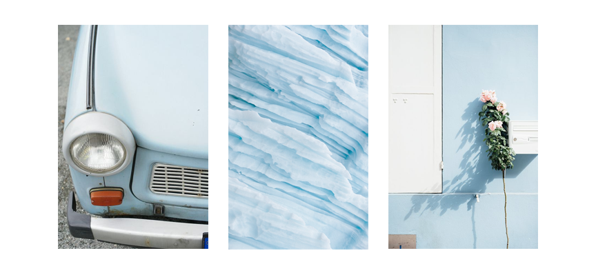 That light SMEG blue which feels so creamy cool is retro first of all. The nostalgic feeling when I was obsessed with pastels is also felt in the reminder of the 60's and the cool neon of the 90's. Swingin' dresses, powder blue vintage cars, and tall rectangular apartment buildings in the art deco pastels of Miami beach all have these shades, and the more we see them, the more we link them to the era.Pastel blue then reminds us all of nature. You may not think about it right away when you see it, but it's in the environmental way it fills a space and the way it reminds us of water and the sky. It can easily give us that emotion without screaming: "this is the outdoors." Then, of course, nature photography looks beautiful over it, plants fill pastel blue corners beautifully, and wood tones bring so much warmth.Contrast also works well with light blue. That glam black and white is a wonderful contrast to a light, filling color. Then adding gold finishes the space off, feeling perfectly put-together and feminine. The perfect touch of Hollywood Glam.
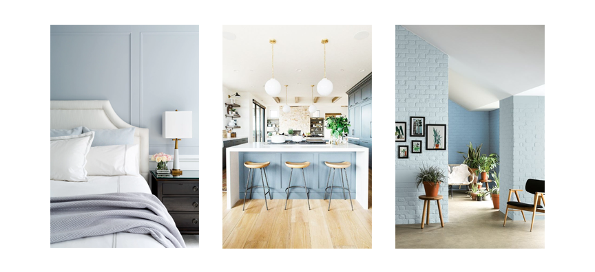 Blue can be relaxing or chic, transitional or modern, and with easy additions into your home, a white corner or empty space can feel natural and intentional.
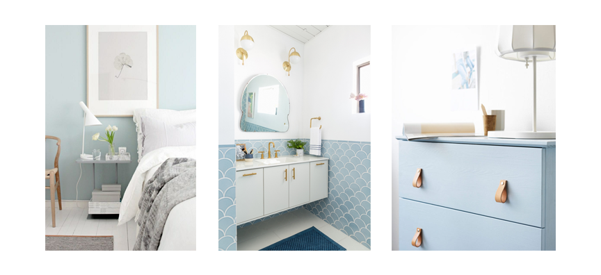
- Pastel blue works so well in bedrooms because of the naturally calming quality it has while feeling morning energizing against bright white and wood tones. A light blue headboard or feature wall fills a bedroom with personality while reminding you of calming seas and skies.
- Because of its connection to water, pastel blue tile is perfect in bathrooms. Navy blue feels nautical, indigo blue feels sharp and modern, but light blue feels atmospheric without feeling overwhelming.
- Painting a piece of simple furniture is definitely the easiest addition you can use to add pastel blue to any space. It works with other shades of blue, a room full of neutrals, or bright white too.
 Do you feel it! The breezy summer pull of pastel blue in your space? Fill any space with this color, and you will feel emotion of the outdoors and retro nostalgia. It also works perfectly with other pastels - the blush pink of last week or the wonderful airy purple of my next post 😉1 / 2 / 3 / 4 / 5 / 6 / 7 / 8 / 9