Fall Colors - Autumn Blues
Autumn is the season of warm sweaters, burning fires, and deep natural woods. Warm tones are found absolutely everywhere, and autumn leaves burn the colors of the sun.I love the fall! Since it is my favorite season, I go all out. I want my clients to feel the season as much as I do!Blue may feel like an unexpected color for autumn, but the deep sea of Autumn blue washes a space in encompassing color without feeling fully winter. Cozy materials, and natural accents add to the feeling with reminders of the warm tones you typically think of when autumn crosses your mind.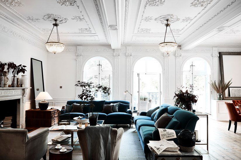 Deep, midnight blue fill the evening sky on fall nights, and gray skies are washed with swaths of cool gray. Also, any warm colors stand out incredibly well against the strong background of peacock blue. And neutrals just add to the calming effects of calming, romantic, deep blue.
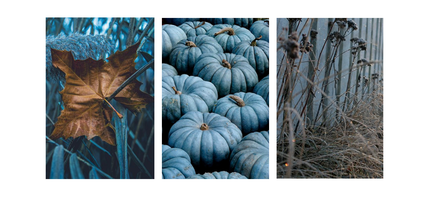 More Cool Autumn below ⬇☄️💙🍂🍁First of all, a whole lot of this color in one room is an incredible statement. Just like any deep color, a whole room of a similar tone feels tangible and encompassing. It's an emotional experience to walk into a room completely filled with a color - especially deep peacock blue. Blue itself is such a deep, spiritual color. It feels serious, while at the same time casting a calming atmosphere, almost in a pacifying way. It's like if a room filled with this deep blue acts as like an isolation chamber or sensory deprivation room.
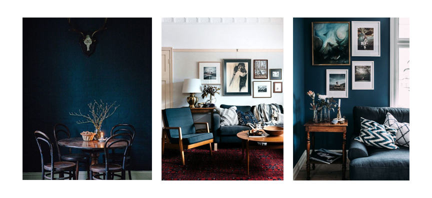 Copper is the metallic of autumn - in my mind. The warm tones are reminiscent of fall leaves, and the rarer finish feels magical in so many settings, but especially autumn blue. Together, the combination feels rare and expensive, while still feeling relatable and even a little fun.
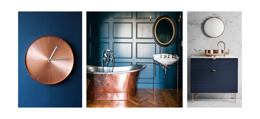 Texture, and natural materials also keep this color scheme feeling modern and at ease. Eclectic spaces are either filled with color, or neutral, but one striking color against natural materials feels like the most relaxing option.White also keeps these spaces feeling relatable and accessible. It literally brightens the space, as well as give some breathing room to a color that could be oppressive if not broken up in the space correctly.But just white would feel too stark - including natural tones or other finishes is really important as the finishing touches. Creating balance is always the most difficult dilemma, but not as hard as one might think.
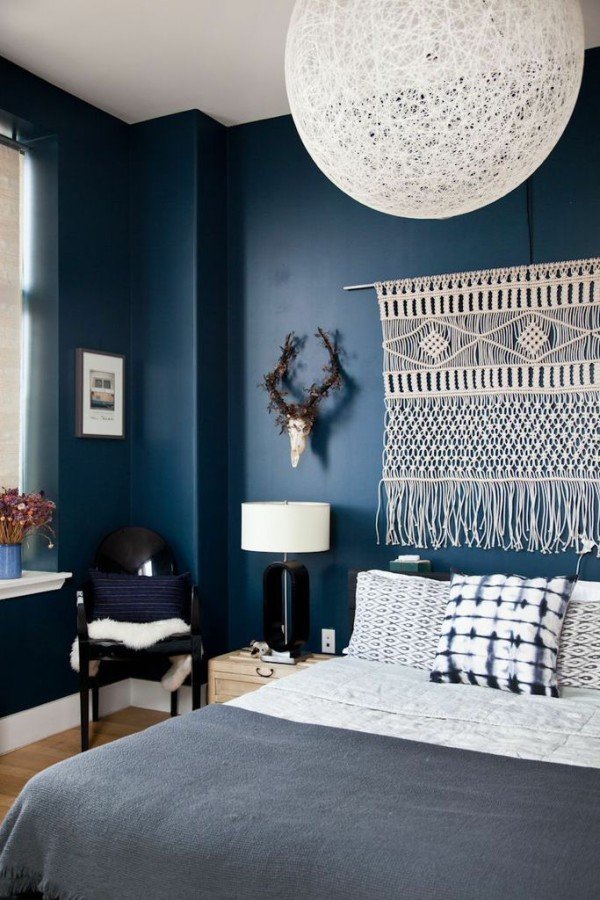 Scandinavian skies with light naturals and minimal furniture also look great in fall blue. The simple furniture, authentic materials, and floating furniture elevates this deep blue to a lighter level.
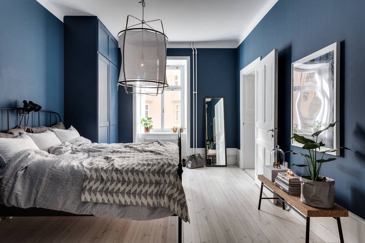 I'm pretty sure one day my office will be filled with the deep-breath giving autumn blue. It seems like the perfect environment for such a vast and mind-boggling color, with an environment where white and copper can accent, and natural materials can make their stand. With the sheer number of books I have, a library feel will definitely be the perfect finish to a space already breathing deep into the calming chill of autumn breeze.1 / 2 / 3 / 4 / 5 / 6 / 7 / 8 / 9 /